

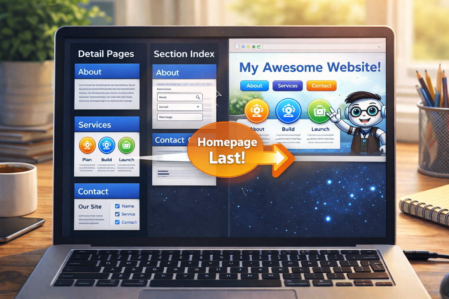
The homepage should present the site you built, not the site you only imagined.
When the homepage comes later, it can point to real sections, real pages, and real strengths. That makes it much easier to write and much more useful to visitors.
Why most people want to make the homepage too early
The homepage feels like the obvious starting point because it looks like the “front” of the site. But in practice, starting with the homepage too early often causes problems:
- the sections are still vague
- the links are not real yet
- the messaging is too abstract
- the hero promises things the site does not yet deliver
- the homepage has to be rewritten later anyway
That is why this workflow flips the order.
The homepage should be a summary of substance, not a substitute for substance.
First build the real pages. Then build the page that introduces them.
What should already exist before the homepage?
By the time you reach this step, you should already have:
- a clear site definition
- an approved filename tree
- approved image assets and their URLs
- shared
site.cssandsite.js - the real detail pages
- the section index pages
- the sitemap files
That means the homepage can now be built on reality.
If the homepage is built too early, it often becomes a page full of promises.
When it is built later, it can become a page full of real pathways.
What the homepage is actually for
A strong homepage usually does not try to explain everything in full. Its job is to:
- tell the visitor what the site is
- tell the visitor who the site is for
- show the main paths into the site
- highlight the strongest sections or pages
- build trust quickly
- make the next click easy
It is a guide page, a promise page, and a structure page all at once.
Why the homepage is stronger at the end
1. The sections are real
You no longer have to guess what to feature. The sections already exist.
2. The language becomes clearer
Once the site exists, it becomes easier to describe what it really does.
3. The visual system already exists
Shared CSS, images, and cards are already in place, so the homepage can fit naturally into the site.
4. The links are trustworthy
The homepage can point to finished content instead of placeholders.
What a strong homepage usually contains
A well-built homepage often includes:
| Part | Why it belongs |
|---|---|
| Hero section | States what the site is and why it matters |
| Main value statement | Helps the visitor understand the site quickly |
| Section cards | Show the main paths into the site |
| Helpful supporting visuals | Reinforce the site’s tone and structure |
| Founder or mission note | Builds trust and explains why the site exists |
| Next-step call to action | Helps the visitor continue |
How the homepage should relate to the rest of the site
A homepage should not compete with the section pages or detail pages. It should help the visitor reach them.
In other words:
The homepage should be the best starting point, not the only meaningful page.
That is an important distinction.
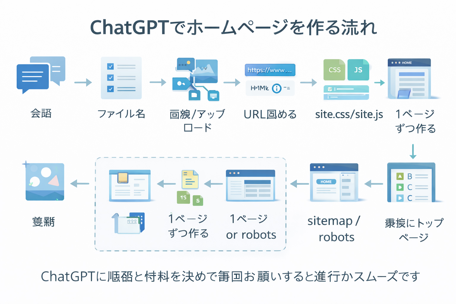
How to prompt ChatGPT for the homepage
At this stage, you can finally make a much stronger homepage prompt because the site is already real.
Example prompt
Make /en/index.html

This homepage should reflect the real completed site.
The site now includes these real sections:
- /en/training/
- /en/tools/
- /en/history/
- /en/faq.html
- /en/about-webbie.html

Use these approved images:
https://website.co.jp/images/make-website-hero-main.jpg
https://website.co.jp/images/webbie-mascot.jpg
https://website.co.jp/images/website-workflow-diagram.jpg
https://website.co.jp/images/webbie-pointing.jpg

Use the shared /site.css and /site.js.
The homepage should:
- clearly explain what the site is
- explain who it is for
- highlight the training path
- highlight the tools section
- show the site philosophy
- feel polished, useful, and mobile responsive
This is far better than a homepage prompt written before the site existed.
The homepage gets easier when you no longer have to invent the site from the homepage outward.
By this stage, you are not inventing the site. You are presenting it.
How real sections improve the homepage
Once the real sections already exist, the homepage can honestly say things like:
- start with the training sequence
- learn the core tools
- read the history and founder story
- explore the mission behind the site
Those are much stronger than vague homepage promises like “amazing resources coming soon.”
How this step connects to founder credibility
The homepage is also where the site can finally introduce the deeper mission behind website.co.jp:
- learning websites practically, not abstractly
- building locally first
- using ChatGPT with discipline
- staying in control of files, assets, and publishing
- avoiding dependency and technical hostage situations
That founder message lands better once the supporting site content already exists.
What not to do when making the homepage
Avoid these common mistakes:
- trying to explain the whole site in exhaustive detail on the homepage
- failing to point clearly to the strongest sections
- using weak or generic hero messaging
- pretending unfinished sections are already mature
- writing the homepage like a sales pitch when the site is actually a training resource
Do not turn the homepage into a giant wall of text.
The homepage should orient, highlight, and guide. The deeper pages do the heavy lifting.
What a good homepage feels like
A strong homepage for this kind of site should feel:
- clear
- helpful
- confident
- organized
- welcoming
- real
It should feel like the visitor has arrived at a place that knows what it is doing.
Why this step comes before grading
In this workflow, grading the site comes after the homepage because:
- the homepage is part of the final public impression
- the site is not fully presentable until the homepage exists
- grading is more useful once the site has its true front door
That makes the final review more honest.

Common beginner mistakes
1. Making the homepage first and then rebuilding it repeatedly
This is one of the most common sources of wasted effort.
2. Writing the homepage without real destination pages
If the internal targets do not exist yet, the homepage often becomes weak or dishonest.
3. Giving the homepage too many jobs
It does not need to replace every other page. It needs to direct the visitor into the right paths.
4. Forgetting the site’s actual audience
A homepage for beginners should sound different from one aimed at experts.
5. Ignoring the real strengths of the built site
The homepage should highlight what the site genuinely does well.
The homepage should be the strongest guided summary of the site, not a substitute for building the site.
Build the real site first. Then let the homepage present it beautifully.
What you should have by the end of this step
By the end of Step 12, you should have:
- a homepage built on real sections and real pages
- a homepage that uses approved image assets
- a homepage that relies on the shared design system
- a homepage that honestly represents the site’s mission
- a site that is finally ready for full review and grading
Mini cheat sheet
Homepage-last means:
- build the real sections first
- build the detail pages first
- build the section indexes first
- build sitemap files first
- then build the homepage
- make the homepage a guided summary of the real siteCan you do these six things?
Completed: 0/6